
Keeping it current · 5 min read
What should be on a coffee shop menu?
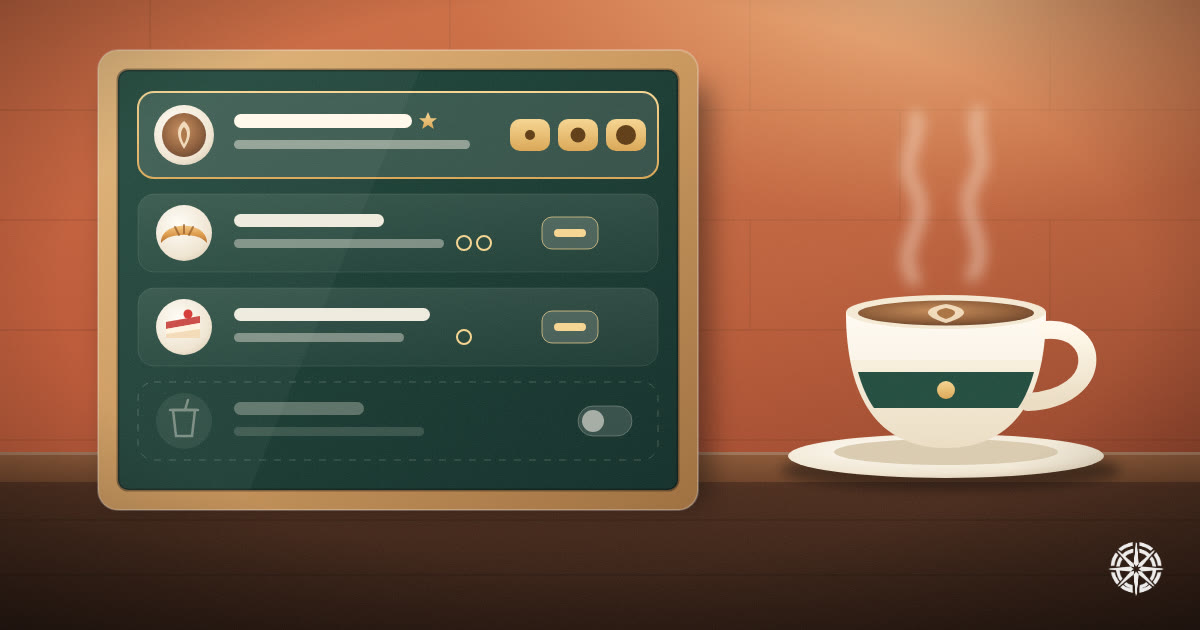
The short answer
Fewer things than you think, grouped the way people order. Lead with the item you are known for, give every item one line saying what is in it, show the price for each size and extra, note allergens, and hide what has run out. A short menu that is always true beats a long one that is half wrong.
On this page
Most café menus are written once, the week before opening, and then patched. A price goes up and someone writes over it. An item runs out for a month and stays on the board. By the second year the menu describes a café that no longer exists.
The fix is not a better-looking menu. It is deciding what the menu is for, and then keeping it true.
Start with what you are known for
Somebody opening your menu wants to know two things fast: what you are good at, and what it costs. So the first thing they see should be the item people come to you for, not the espresso list every café has.
Croffee in Beirut is a good example. Its menu opens on croffles, the thing in its name, and sorts them "Popular First" by default, so the bestsellers sit at the top without anyone having to scroll for them. Its home page also gives one croffle a week its own spot as the special.
If you do not know what your signature is yet, your till does. The three items you sell most are the ones to lead with.
Group it the way people order
Categories should match the decisions a customer is making, not how your kitchen is organised. A common shape for a café is:
- Your signature: croffles, pastries, whatever you are known for
- Hot drinks and cold drinks, kept separate, because people usually know which they want before they look
- Food: sandwiches, salads, something savoury for lunch
- Desserts
Seven or eight categories is plenty. If a category has one item in it, fold it into another. A long menu does not look generous. It makes the choice harder, and it gives you more prices to keep up to date.
One line per item, saying what is in it
"Delicious croffle" tells nobody anything. "Nutella, pistachio spread and crunchy kunafa" tells them what they are ordering, and it is also what they would type into a search if they were looking for it.
Keep each description to one line and name the actual ingredients: the cheese, the sauce, the spread. That also answers most allergy questions before anybody has to ask.
You do not need a full allergen table, but you do need two things:
- A clear line saying that items may contain allergens, and that customers should tell you about theirs when they order. Croffee's menu ends with exactly that.
- Honest ingredient lists in the descriptions, so somebody avoiding nuts can see the pistachio before they order.
Labels like "vegan" or "gluten-free" are only worth adding if they are strictly true. An exception buried in the kitchen is worse than having no label.
Price every size and every extra
Hidden costs are what make people feel cheated at the till. If oat milk is extra, say how much. If a large is more, show both prices.
Online, this matters even more. Someone ordering for pickup will not ask. They will compare your menu against the café down the road, and a price that changes at the counter loses you the next order.
If you price in dollars, as Croffee does, make sure the menu, the delivery app and the board behind the counter all show the same number. When they disagree, customers believe the lowest one.
What to do when something runs out
The worst thing a menu can do is offer something you cannot make. Crossing it out on a board is fine inside the café. Online, somebody chooses it, travels to you or orders it, and finds out at the end.
So take it off while it is unavailable. On Croffee's site, an item marked unavailable disappears from the menu until it is switched back on, and nobody has to delete it and type it in again later.
Where the menu should live
Put the menu on your own website as real text on a normal page. We cover why in should your menu be a PDF. Then point everything else at that page: the QR code on the table (what a QR code menu should point at), your Instagram bio and your Google listing.
A delivery app will have its own copy. Croffee takes delivery through Toters, for example. Treat your own page as the master and update the app from it, not the other way round. If you are still setting all this up, what a café needs online before it opens covers the order to do it in.
Keeping it true without calling a developer
A menu stays true only if changing it is quick enough that you actually do it. If every price change is a message to a developer, it waits until there are ten of them.
On a site built with Helm, the menu is a section of the business's own dashboard. In Croffee's, every item has its name, description, price, photo and category, a mark for popular, its extras with their prices, and a switch for when it runs out. Croffee's menu page reads the latest version every time it loads, so a published change is live for the next customer who opens it.
That is also what makes the small things possible: a weekly special, a seasonal drink, a loyalty card that rewards the items you most want people to try.
The short version
- Lead with your signature item.
- Seven or eight categories, grouped the way people order.
- One specific line per item, naming what is in it.
- A price for every size and extra, the same everywhere.
- An allergen note, and honest ingredients.
- Hide what has run out.
- One master menu on your own site, and everything else points to it.