
The basics · 4 min read
What is web accessibility, and does my small business need to care?
The short answer
Yes, and most of it is straightforward. Accessibility means your site works for people using screen readers, keyboards, magnification or poor eyesight — which overlaps almost entirely with the things that make a site work well for everyone. Real text instead of images, enough colour contrast, alt text, and forms with proper labels covers the majority of it.
On this page
What it actually means
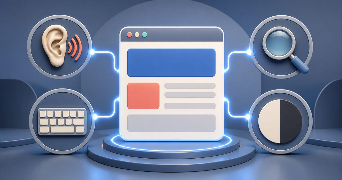
Making your site usable by people who interact with it differently: using a screen reader, navigating by keyboard rather than mouse, magnifying the page, using high contrast, or having limited fine motor control.
The framing that helps most: these are not edge cases. Anyone using a phone in bright sunlight is dealing with contrast. Anyone with a broken arm is navigating by keyboard. Anyone over forty is dealing with type size. Accessibility work is usability work that happens to be measurable.
The five things that cover most of it
1. Real text instead of images of text. A menu as a photograph is unreadable to a screen reader, unsearchable, and unmagnifiable. This is the single biggest accessibility failure on small business websites and it is the same fix as the biggest SEO failure.
2. Enough colour contrast. Pale grey text on white is fashionable and hard to read for a large number of people. Free contrast checkers will tell you in seconds whether your text passes.
3. Alt text on images. A written description of what each image shows. Decorative images get empty alt text so screen readers skip them.
4. Forms with proper labels. Each field needs a label that is programmatically connected to it, not just placeholder text that disappears when you start typing. Placeholder-only forms are a common and genuinely disabling pattern.
5. Keyboard navigation that works. Tab through your site. Can you reach every link and button? Can you see where you are? Can you close a popup without a mouse? Popups that trap keyboard users are the most common failure here.
The things that also help everyone
Worth noticing, because it reframes the work as improvement rather than compliance:
- Captions on video help people in noisy places and people who prefer reading
- Clear link text — "our booking page" rather than "click here" — helps everyone scanning
- Logical heading structure helps screen readers and helps anyone skimming
- Tap targets big enough for a thumb helps everyone on a phone
- Text that resizes helps everyone who has ever squinted
None of that is charity. It is the same list a usability consultant would give you.
The legal position, briefly
This varies by jurisdiction and it is worth knowing rather than ignoring. Several regions have laws that apply to business websites, and enforcement has increased. Public bodies and larger businesses face stricter obligations than a small café.
This is not legal advice. The practical position is that the five items above address most of the common failures, and doing them is cheaper than any alternative.
How to check yours
Automated tools catch perhaps a third of issues. They are worth running, they are free, and their output is a starting list rather than a verdict.
The keyboard test. Unplug your mouse and try to use your own site. Book something. Fill in the contact form. This takes five minutes and finds real problems.
Turn your phone's screen reader on and listen to your homepage. This is uncomfortable the first time and it is the most informative thing on this page — you will hear immediately whether your menu is text or a picture.
Where to start
If you do one thing: make sure your menu, prices and opening hours are real text on a page.
That single change fixes the most serious accessibility failure most small business sites have, and simultaneously fixes their biggest search problem. It is the rare case where doing the right thing and doing the profitable thing are the same task.
What a platform can guarantee, and what it cannot
Worth splitting this in two, because "is the platform accessible" is a question with two quite different answers, and conflating them is how "fully accessible" gets claimed by people who have run one automated scan.
The structural half can be built in, and then it stays true. Real headings in order rather than large bold text. Content as actual text rather than pictures of text. Links that are links and buttons that are buttons. Forms with labels attached to their fields. That half is settled when the site is built, and Helm sites are built that way — partly for accessibility and partly because search engines and AI assistants want the identical thing, which is content a machine can parse. The overlap is not a coincidence; a screen reader and a crawler are both reading the page without seeing it.
The content half cannot be guaranteed by anyone but you. Whether your alt text actually describes the image. Whether your link text says where it goes rather than "click here". Whether your headings describe their sections honestly. A platform can make those possible. It cannot make them good, and it should not claim to.
So the fair question to put to any supplier is which half they are claiming. Anyone who says a site is "fully accessible" without mentioning the second half is describing a test result rather than somebody's experience of using it.