
Lebanon · 4 min read
What goes wrong with Arabic websites, and how do I get it right?
The short answer
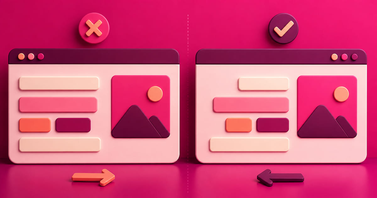
The layout must mirror, not just the text. Navigation, arrows, icons, form fields, progress indicators and alignment all flip in a right-to-left language. Most Arabic websites are a Latin design with translated text poured in, which produces broken spacing, arrows pointing the wrong way, and numbers in the wrong order. Building it properly costs more and it is visible immediately.
On this page
The mistake that causes all the others
Treating Arabic as a translation problem rather than a layout problem.
Someone builds a site in English, adds a language switcher, pours in translated text, and considers it done. What they have produced is an English website containing Arabic words — and every Arabic reader can see that within seconds.
Getting the words right is its own piece of work — how to get your website translated covers that properly. But no amount of good translation rescues a layout that never mirrored.
A right-to-left language does not just reverse the text. It reverses the reading order of the entire interface, and everything positioned relative to that order has to move with it.
What actually has to mirror
Navigation. The menu starts from the right. The logo goes to the right. What was the first item is now the rightmost.
Arrows and directional icons. A "next" arrow points left in Arabic. A back arrow points right. Getting this wrong is the single most common visible error and it makes the interface actively confusing.
Alignment. Text aligns right. Headings align right. Lists indent from the right, and their bullets sit on the right.
Form fields. Labels, placeholder text and validation messages all align right. The cursor starts at the right.
Progress indicators, breadcrumbs, timelines. Anything expressing sequence flows right to left.
Padding and spacing. This is the subtle one. Space intended to sit before an element must move to the other side, or the layout looks slightly wrong in a way readers feel without being able to name.
What must not mirror
Just as important, and frequently overgeneralised:
- Numbers read left to right even in Arabic text
- Phone numbers, prices and dates keep their internal order
- Latin brand names and technical terms stay as they are
- Media controls — play buttons still point right, because they follow the physical metaphor of a tape rather than reading direction
- Photographs are not flipped
A design that mirrors everything indiscriminately is as broken as one that mirrors nothing.
Typography, which most sites ignore
Arabic is not Latin text in a different alphabet. It connects, it has different vertical proportions, and it needs different treatment:
Use a font designed for Arabic. Not a Latin font with Arabic glyphs bolted on. The difference in quality is stark to a native reader.
Increase the line height. Arabic has ascenders and descenders that collide at typical Latin line spacing.
Increase the size slightly. Arabic text at the same point size reads smaller and denser than Latin.
Avoid all-caps styling, which has no Arabic equivalent and does nothing but break the text.
The commercial point
If you serve Arabic-speaking customers, a badly executed Arabic site is worse than an English-only one. English-only is a limitation people understand. A broken Arabic page reads as carelessness about them specifically.
Done properly it costs more, because it is genuinely more work — a second set of layout rules, typography choices, and testing. A quote that offers Arabic at no extra cost is usually offering translated text in a Latin layout.
How to check a site in five minutes
You do not need to read Arabic to catch most of it:
- Switch to Arabic and look at the navigation — has it moved to the right?
- Find an arrow. Is it pointing the way the language flows?
- Look at a form. Are the labels right-aligned, or floating oddly?
- Check a price and a phone number — are the digits still in the right order?
- Look at spacing around buttons and cards. Is it symmetrical, or is everything crowded to one side?
Any failure on that list means the site was translated rather than built, and the same is likely true of everything you cannot see.
What "built rather than translated" is worth
The five-minute check above is a diagnostic, not a fix — and the fix is usually more structural than anyone wants to hear. A site failing those checks is not one stylesheet away from passing. The layout was authored in one direction and the Arabic was poured into it afterwards.
Getting it right from the start costs almost nothing. Retrofitting it costs a rebuild. Which is why it is worth asking about before anybody starts work, and why the question to put to a supplier is not "do you support Arabic" — everyone says yes to that. It is "is the layout mirrored, or is the text translated?", followed by running the five checks above on a site they have already built.
Helm builds both directions as one site rather than two: mirrored layout, correct numerals and date formats, typography chosen for Arabic rather than inherited from the Latin, and one dashboard editing both languages side by side. The company is in London and Beirut, which is the practical reason this became a first-class concern rather than a checkbox.